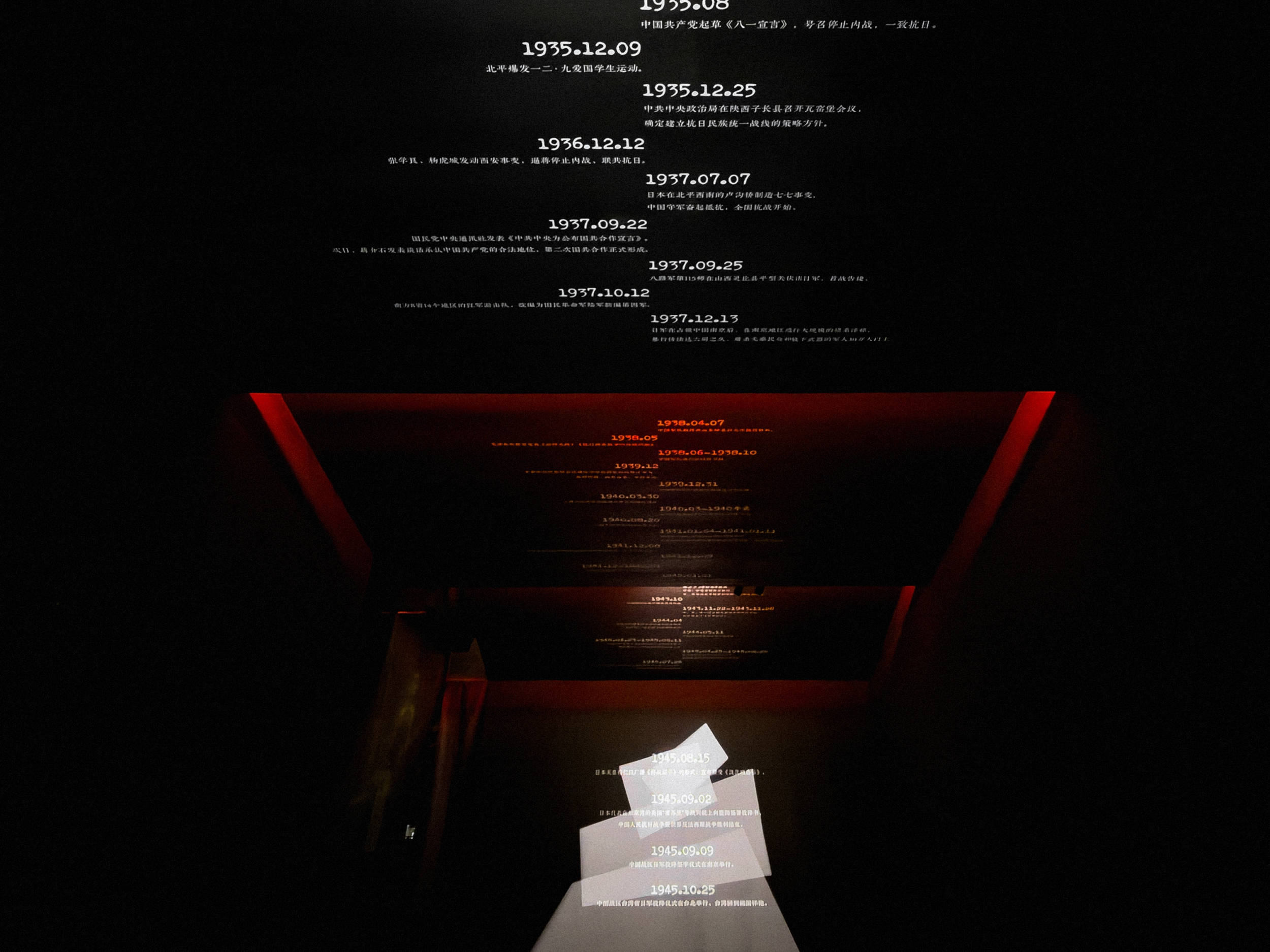
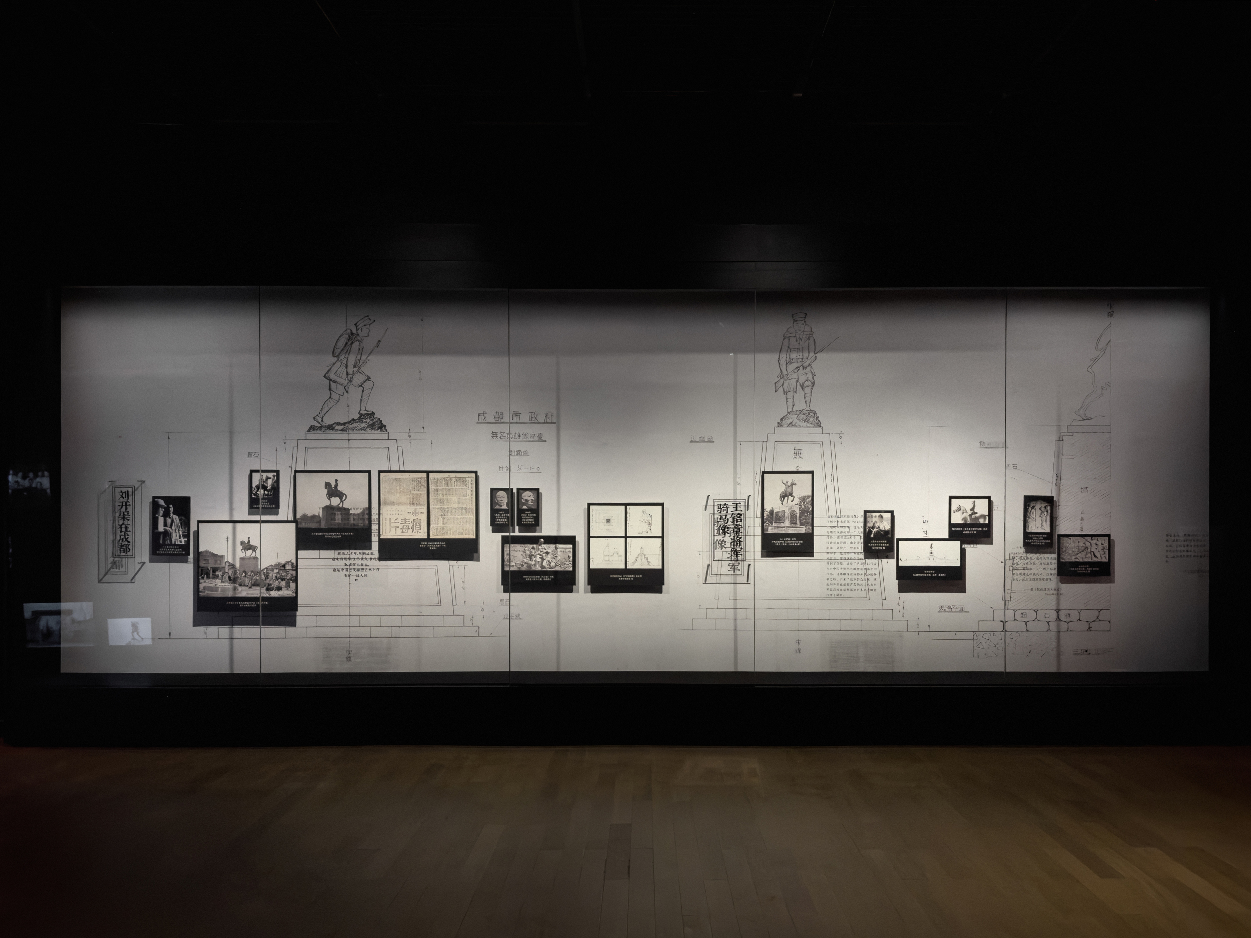
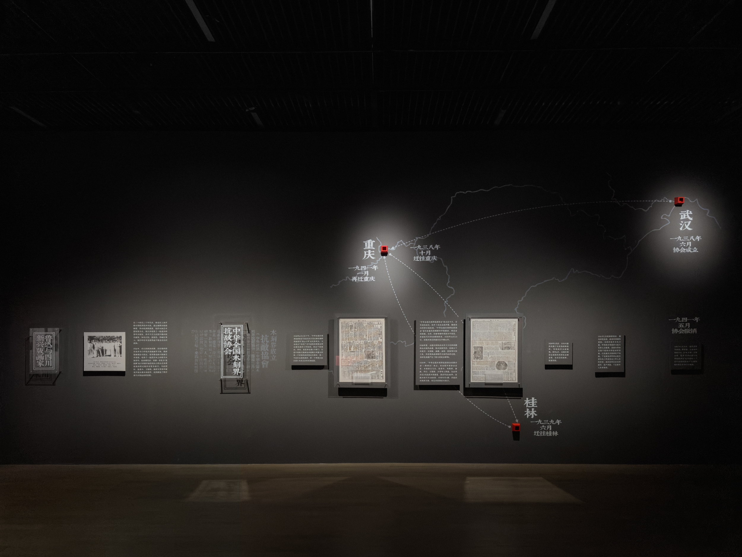
◯ 烽火宣言|抗日戰爭時期四川美術文獻研究展 ◯ DECLARATION AMIDST THE FLAMES OF WAR
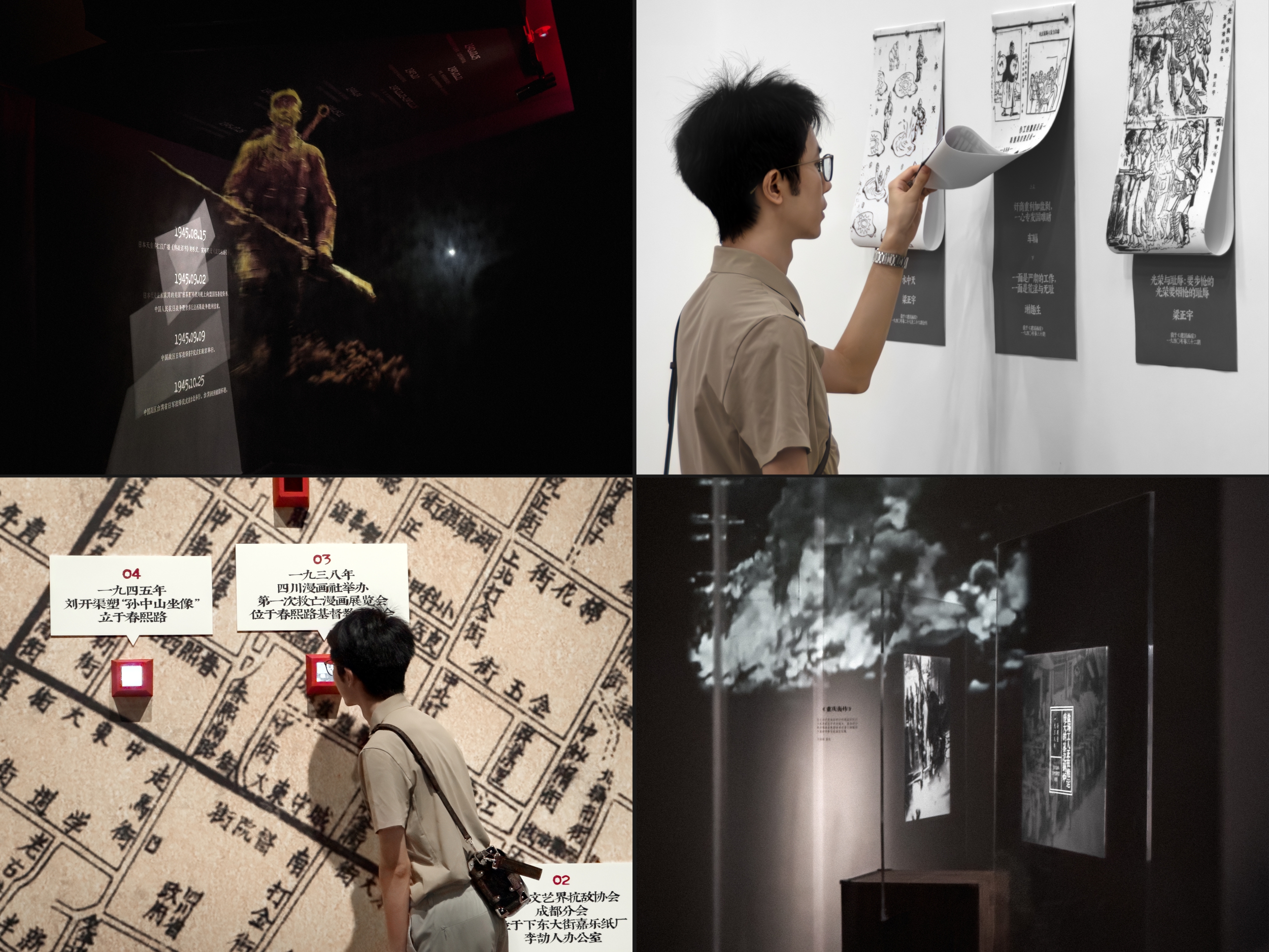
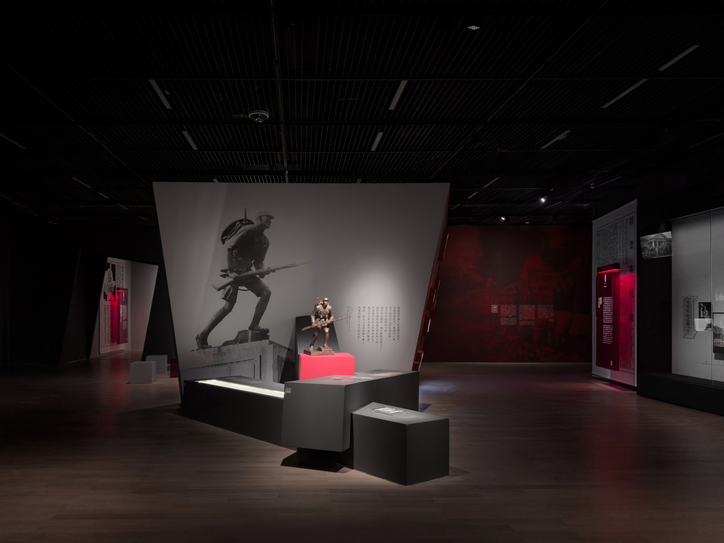
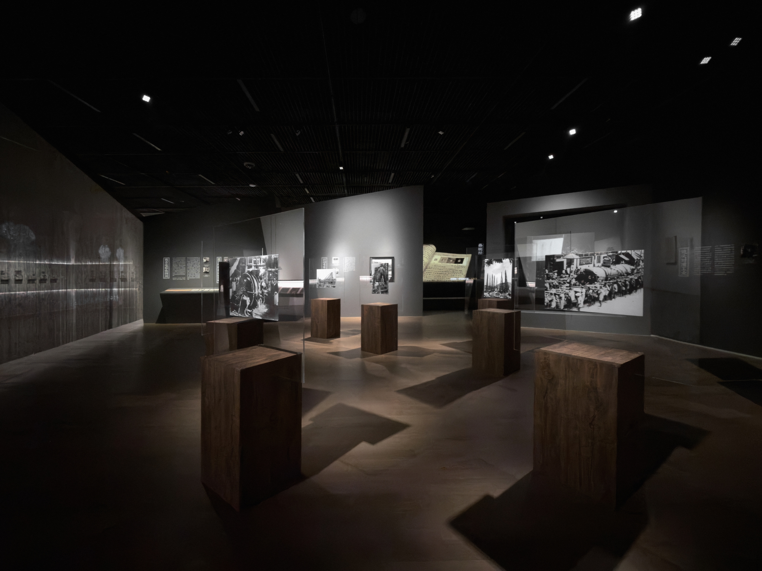
時值中國人民抗日戰爭暨世界反法西斯戰爭勝利80週年之際,由成都市美術館主辦的此次展覽以七篇抗戰時期的藝術宣言為核心脈絡,雖源自不同領域,卻均緊扣救亡圖存的時代主題。
在展陳形式上,展覽突破傳統文獻展的靜態呈現模式,採用沉浸式與互動性相結合的設計,有效增強觀眾對歷史的直觀感知與情感共鳴。
On the occasion of the 80th anniversary of the victory of the Chinese People's War of Resistance Against Japanese Aggression and the World Anti-Fascist War, this exhibition hosted by the Chengdu Art Museum takes seven artistic manifestos from the War of Resistance Against Japanese Aggression period as its core context. Although these manifestos originated from different fields, they all closely focus on the era's theme of saving the nation from peril and ensuring its survival.
In terms of exhibition format, the exhibition breaks through the static presentation mode of traditional document exhibitions and adopts a design that combines immersion and interactivity, effectively enhancing the audience's intuitive perception of history and emotional resonance with it.
Sep. 2025
展覽視覺設計
👉 Read More 閱讀更多
展覽視覺設計
👉 Read More 閱讀更多

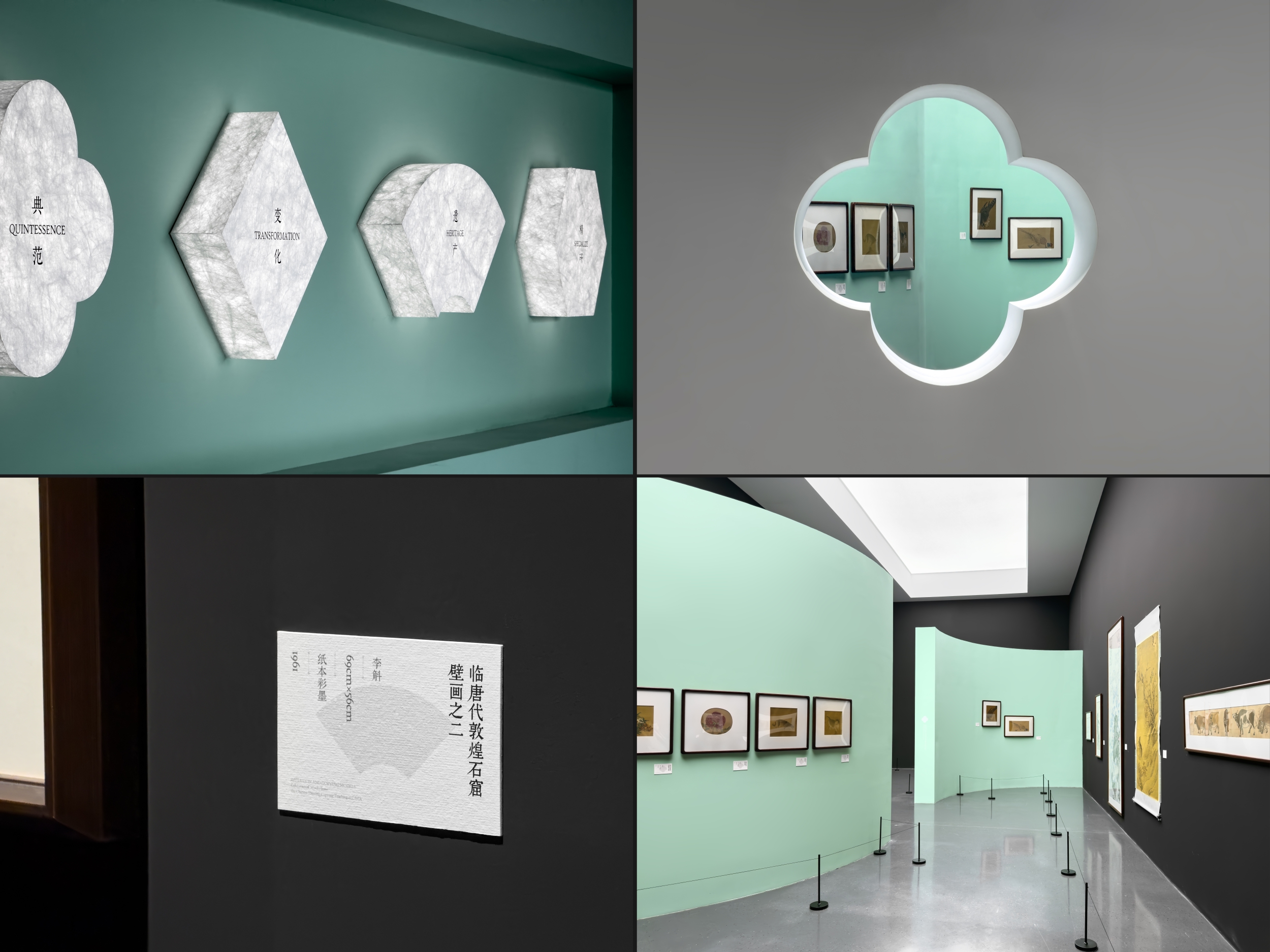
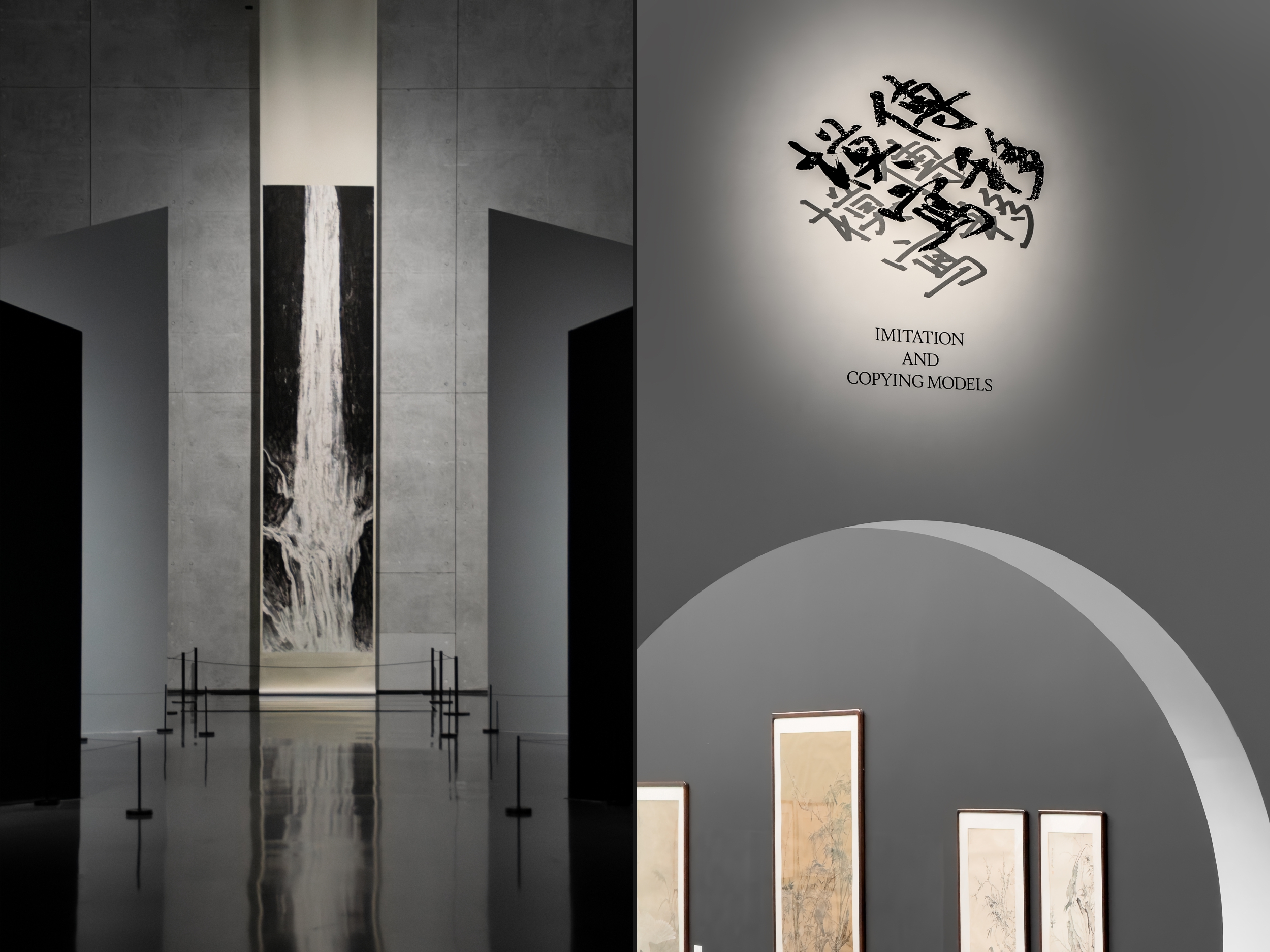
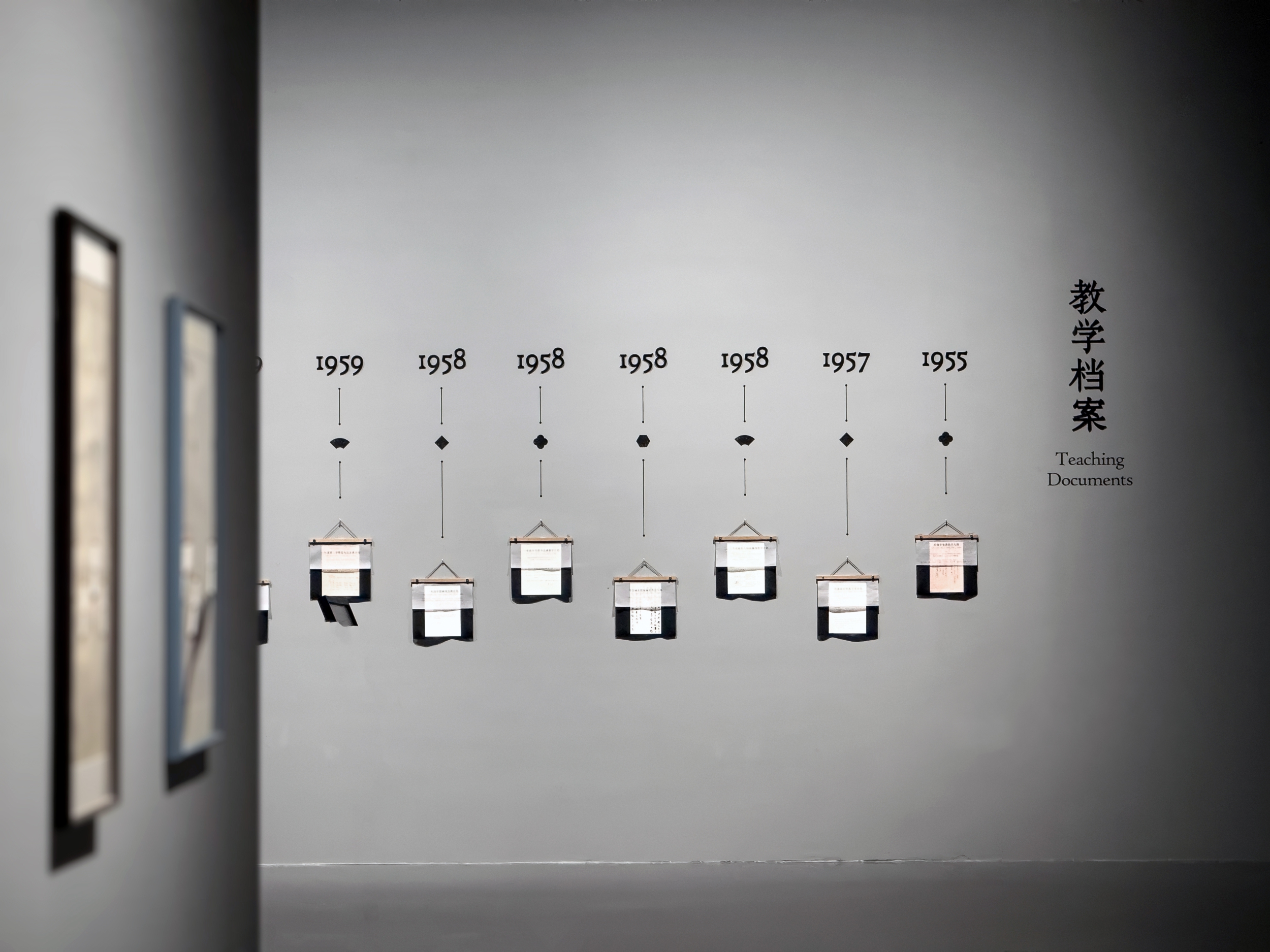
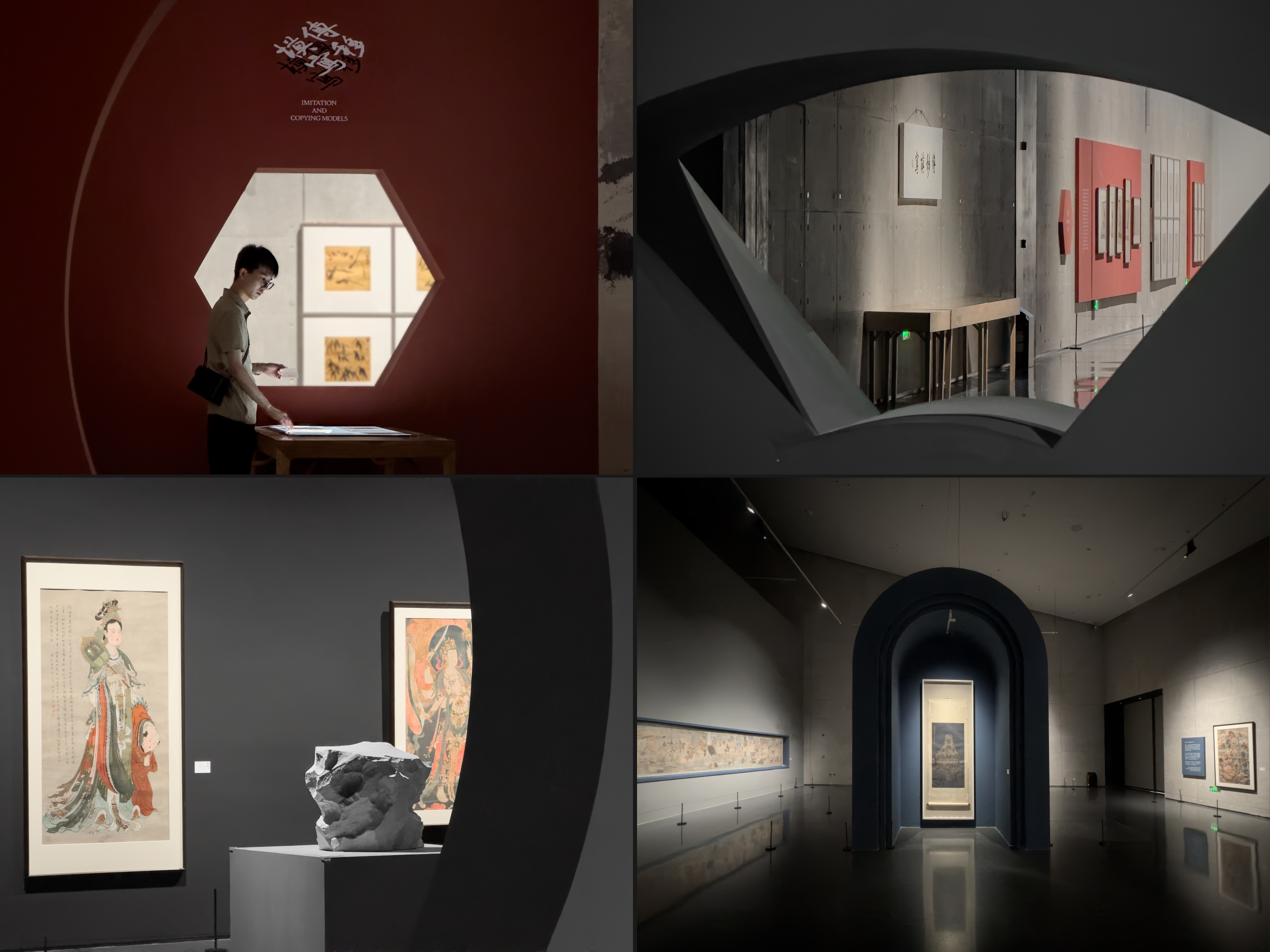
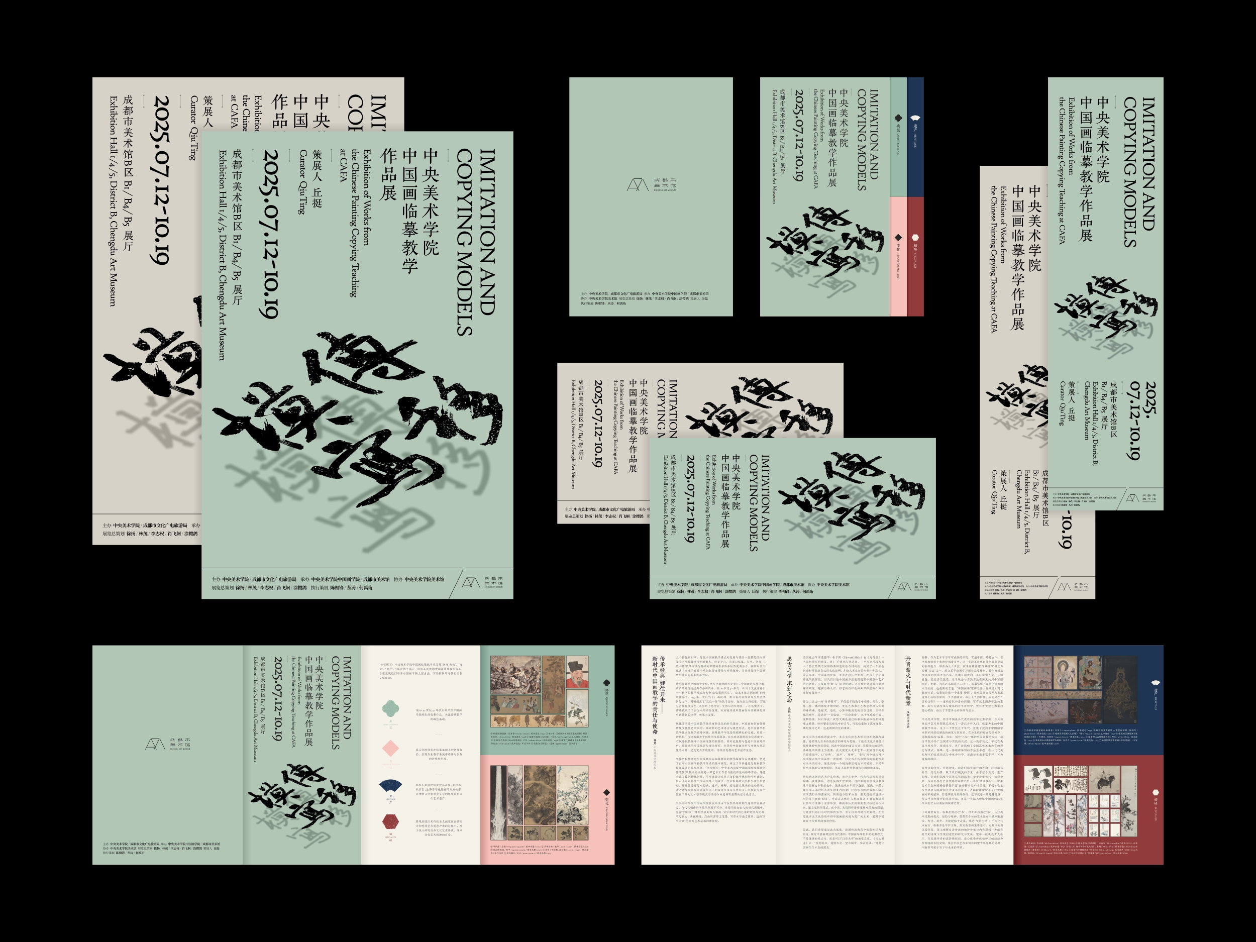
◯ 傳移模寫|中央美術學院中國畫臨摹教學作品展 ◯ IMITATION AND COPYING MODELS
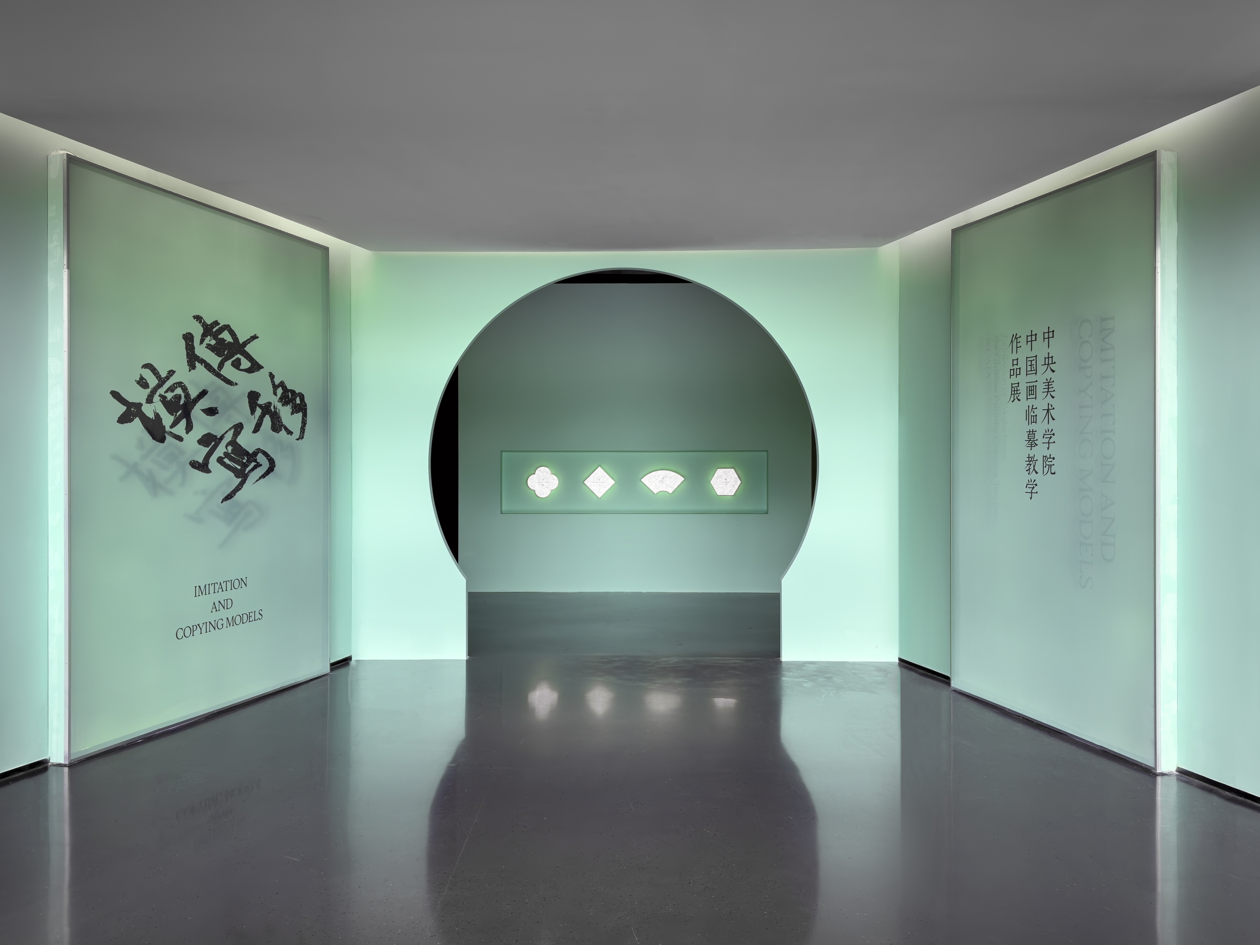
展覽匯聚了齊白石、葉淺予等名家經典臨本,以及《韓熙載夜宴圖》《山水冊》等歷代名作摹寫。以「典範」「變化」「遺產」「精研」 四大篇章、超兩百件作品,全景呈現臨摹技藝從文化遺產守護到中國畫千年傳承的壯闊歷程。
The exhibition brings together classic copies by renowned artists such as Qi Baishi and Ye Qianyu, as well as reproductions of masterpieces from various dynasties, including The Night Revels of Han Xizai and Album of Landscapes. Through four major sections—"Model", "Variation", "Heritage" and "Meticulous Study"—and over 200 works, it presents a panoramic view of the magnificent journey of copying techniques, spanning from the preservation of cultural heritage to the millennium-long inheritance of Chinese painting.
Jul. 2025
展覽視覺 & 展陳設計
👉 Read More 閱讀更多
展覽視覺 & 展陳設計
👉 Read More 閱讀更多
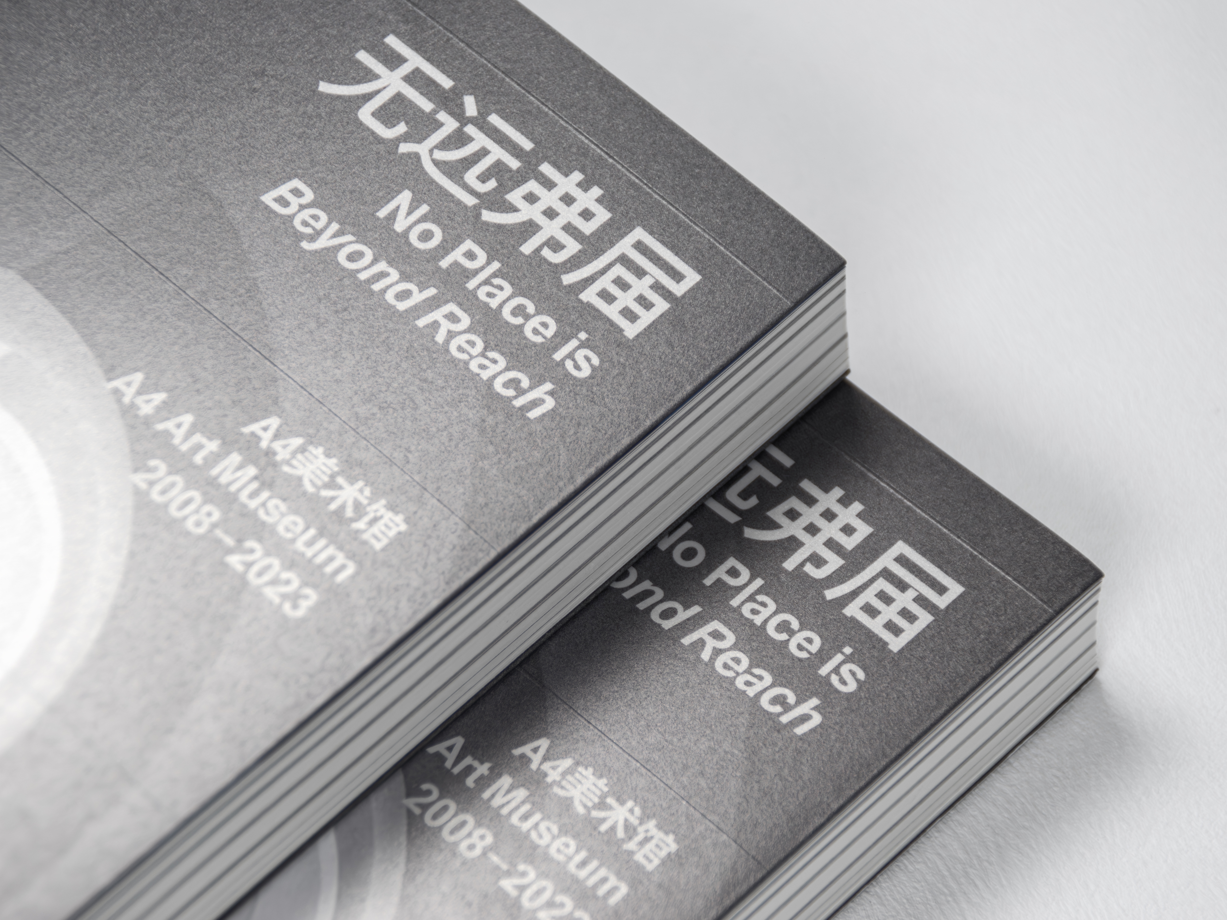
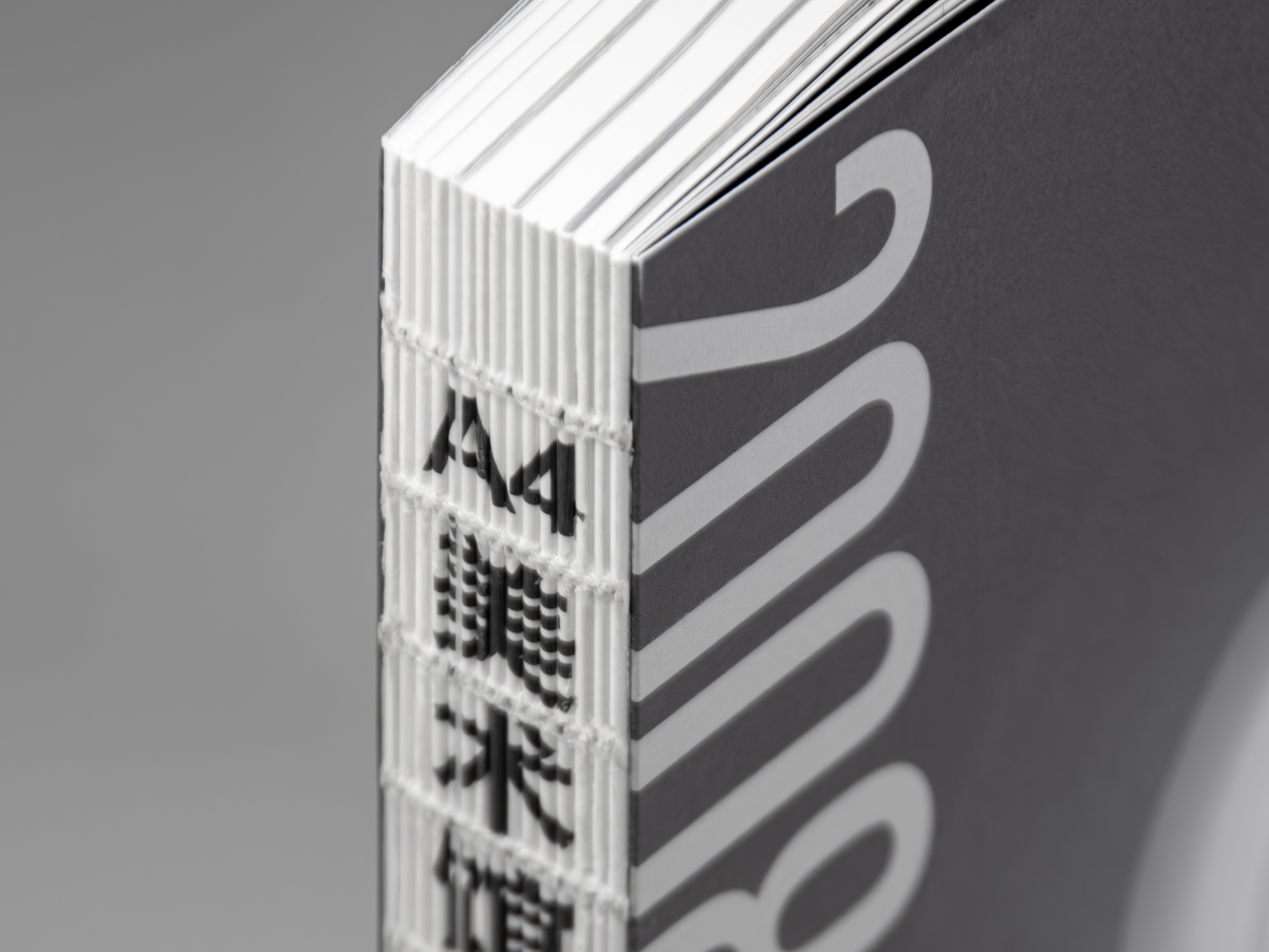
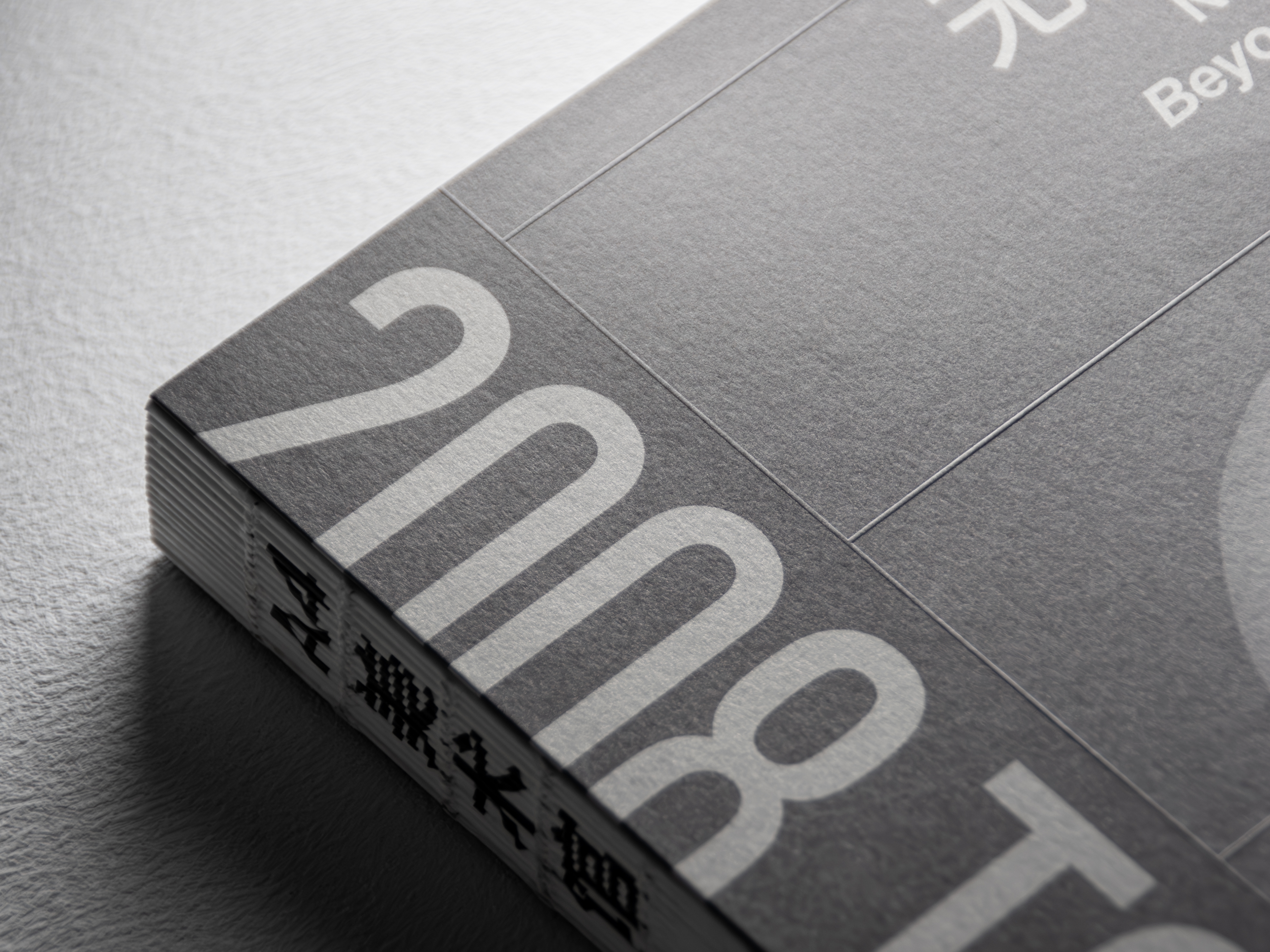
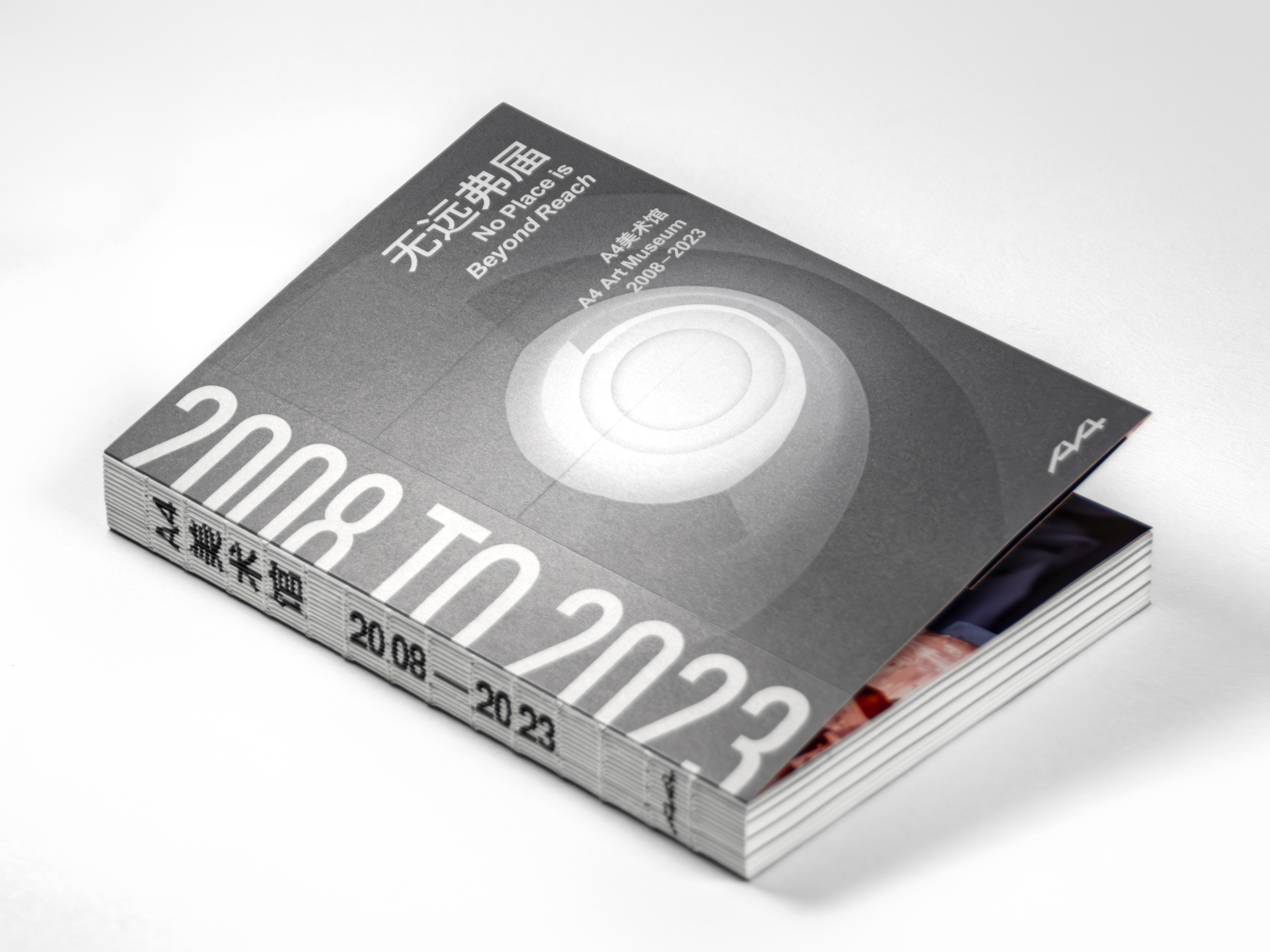
◯ 無遠弗屆:A4美術館2008—2023 ◯ NO PLACE IS BEYOND REACH: A4 ART MUSEUM 2008-2023
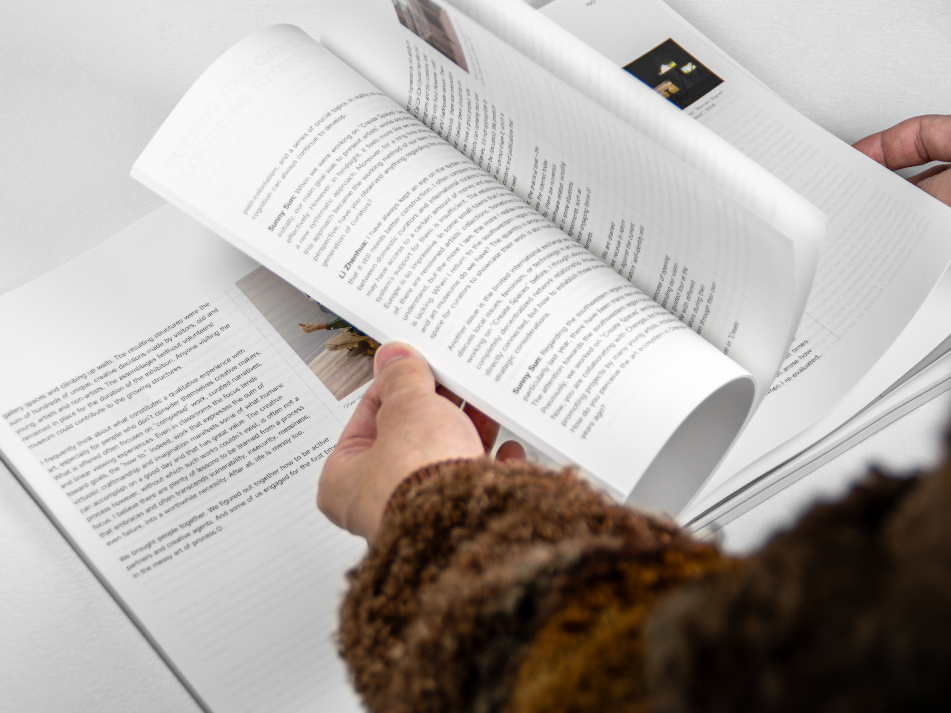
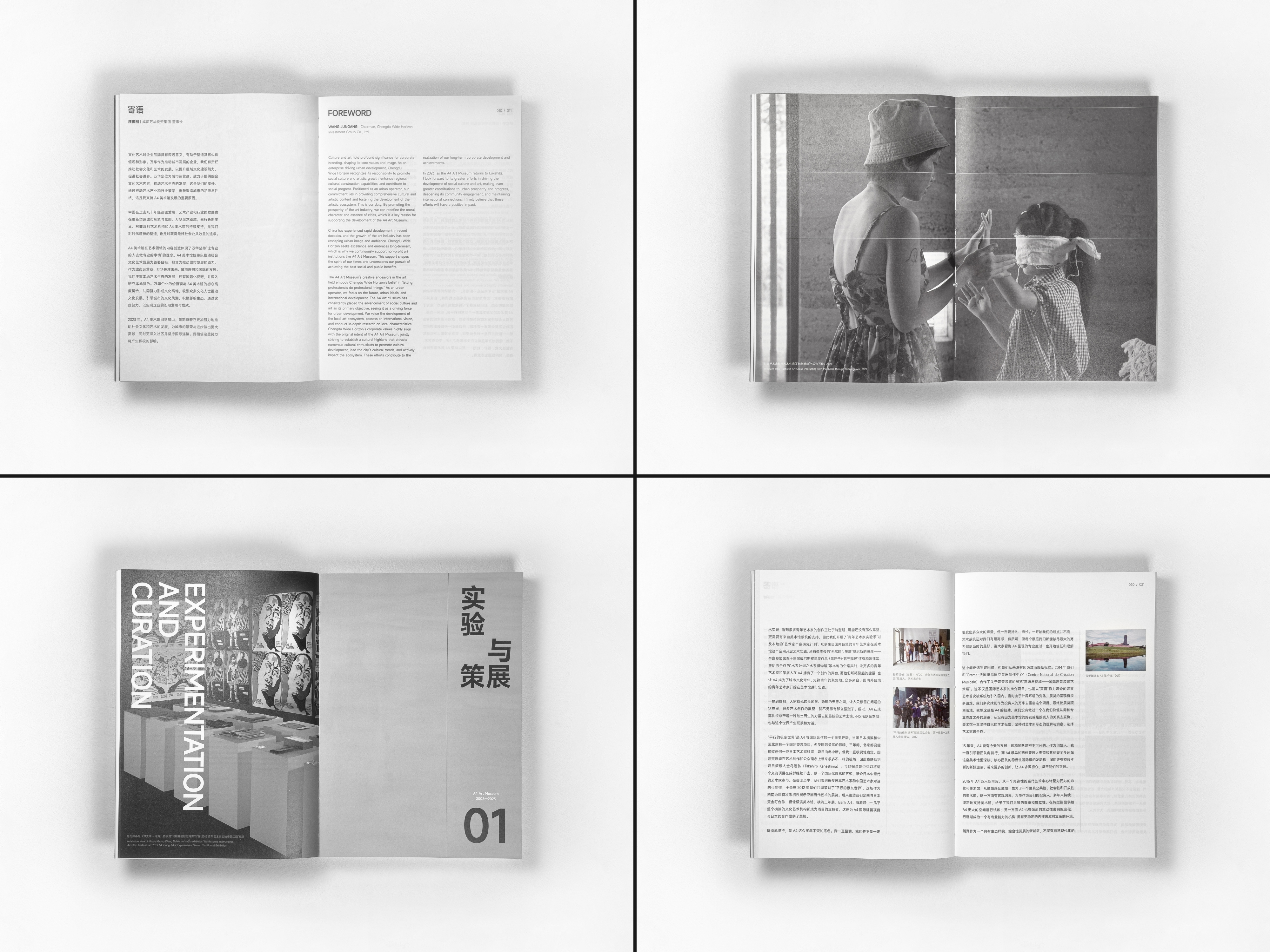
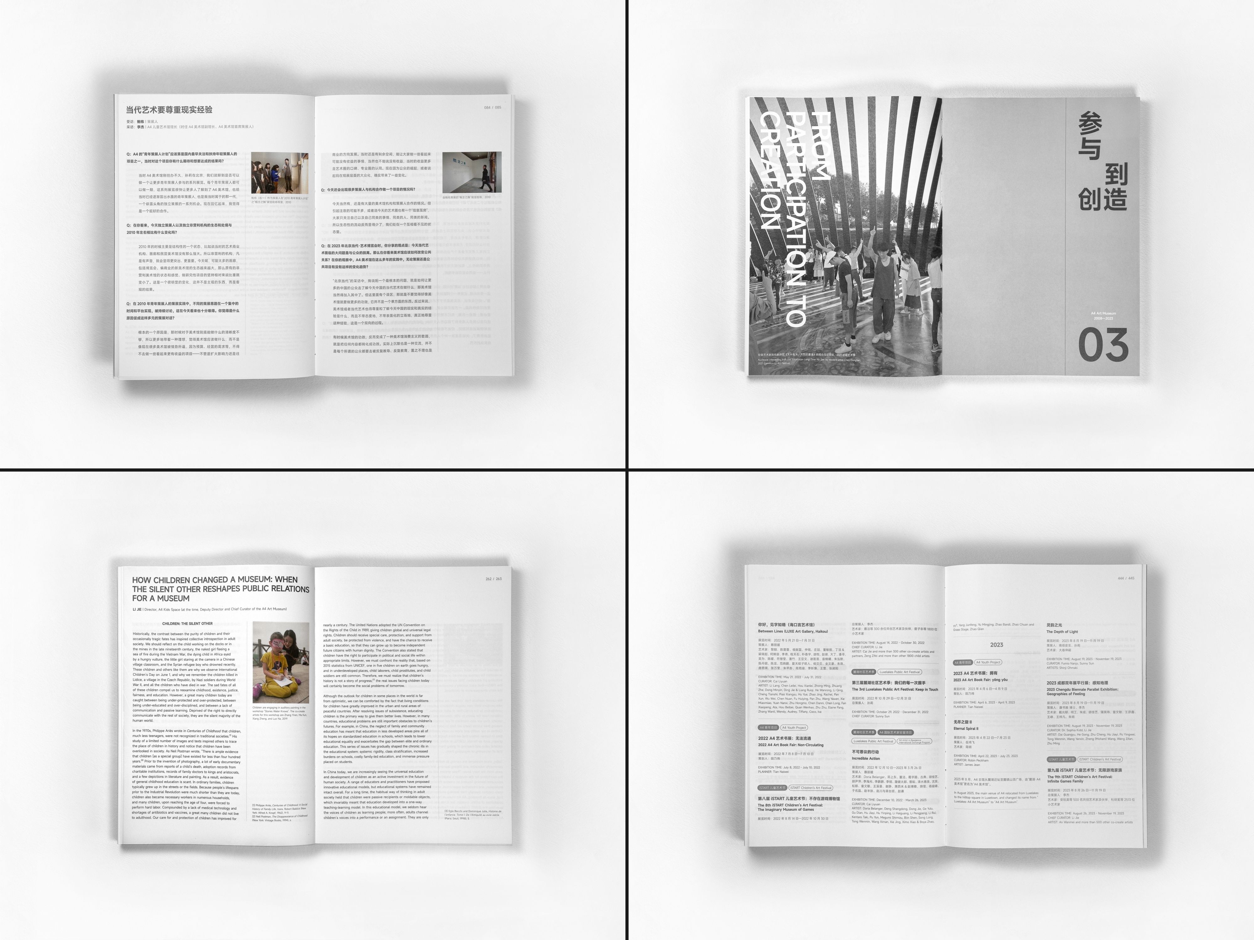
此文獻冊是對A4美術館從創立到蛻變、從試探到深耕的15年發展歷程的精心整理與深度回顧。全書內容以寄語、對談等文字信息為主,輔以部分歷史配圖,以此聯想將檔案文件的視覺語言融入到本書的排印設計之中。
This Literature Book is a carefully organized and in-depth review of A4 Art Museum's 15 years of development, from its foundation to its transformation, from exploration to deep cultivation. The content of the book is mainly composed of textual information such as letters and dialogues, supplemented by some historical illustrations, thus associating the visual language of archival documents into the typographic design of the book.
Nov. 2024
書籍排印設計
👉 Read More 閱讀更多
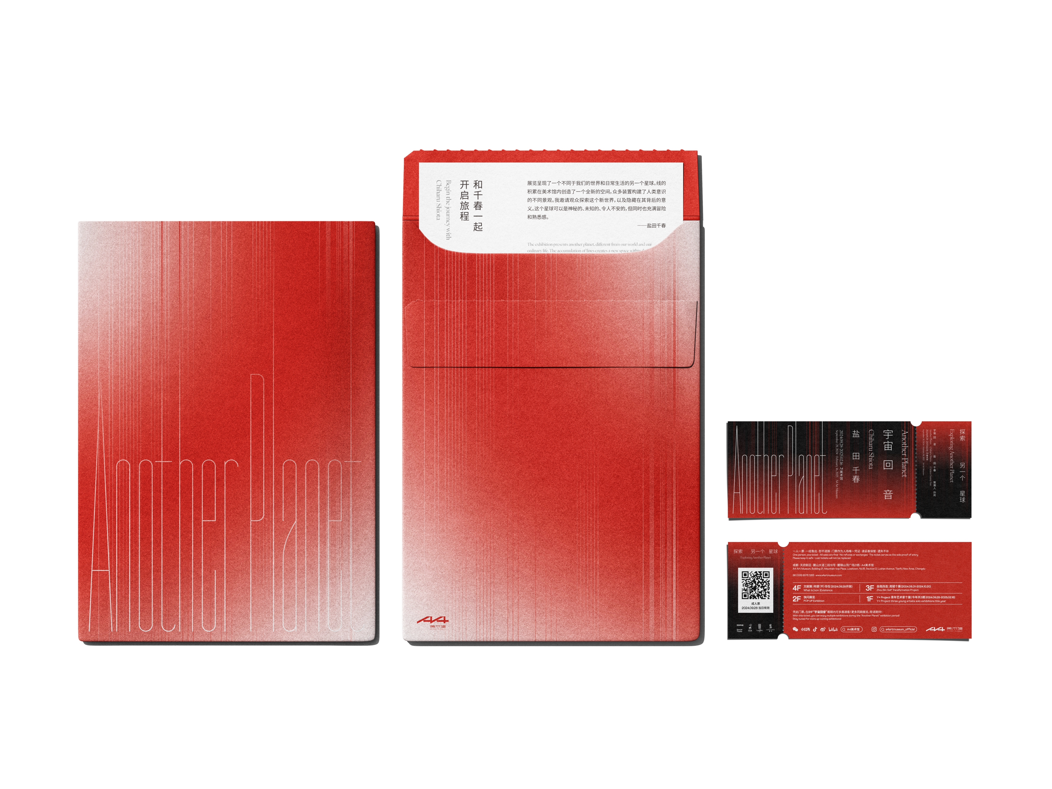
◯ 宇宙回音 · 鹽田千春 ◯ ANOTHER PLANET|CHIHARU SHIOTA
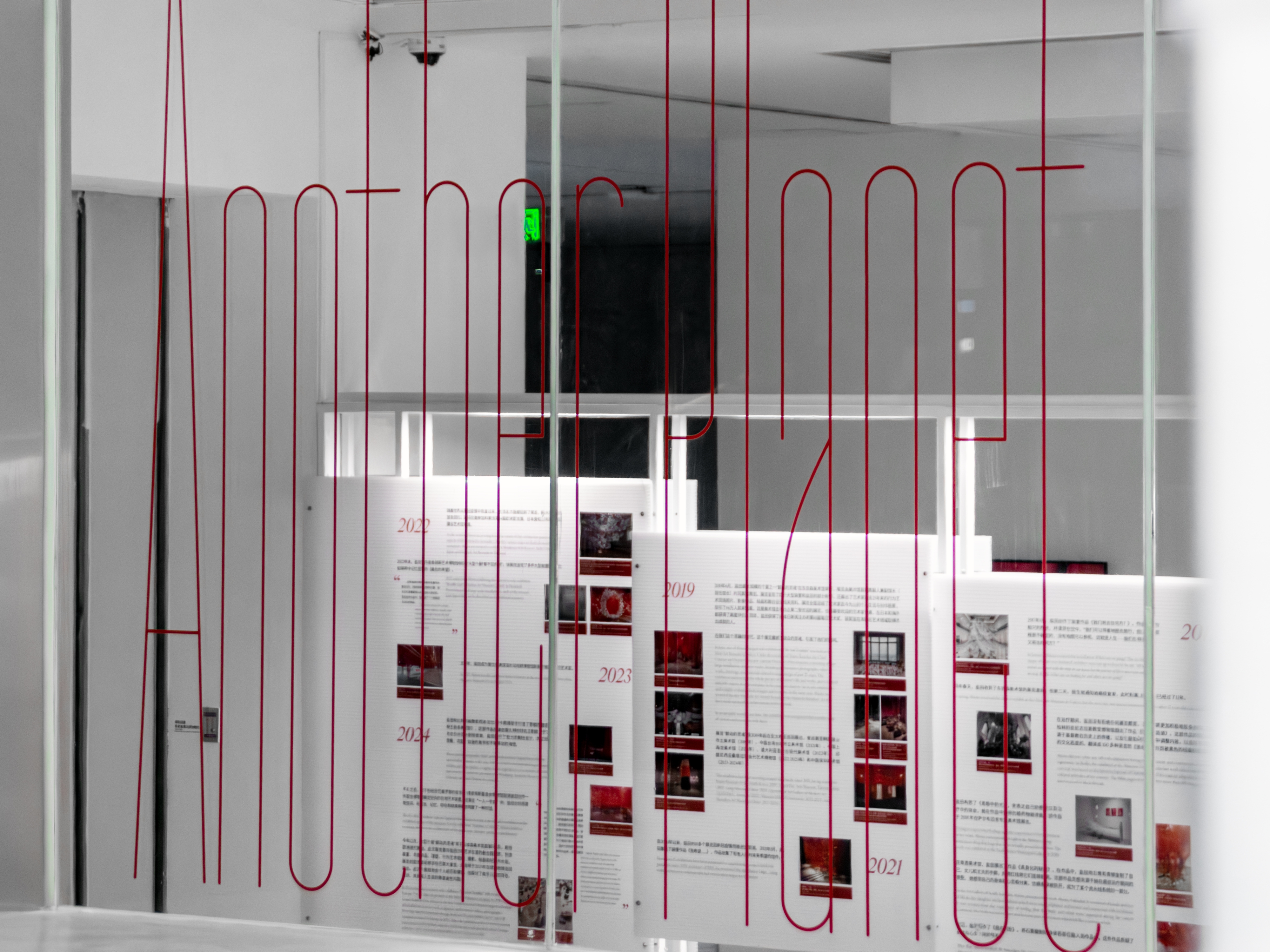
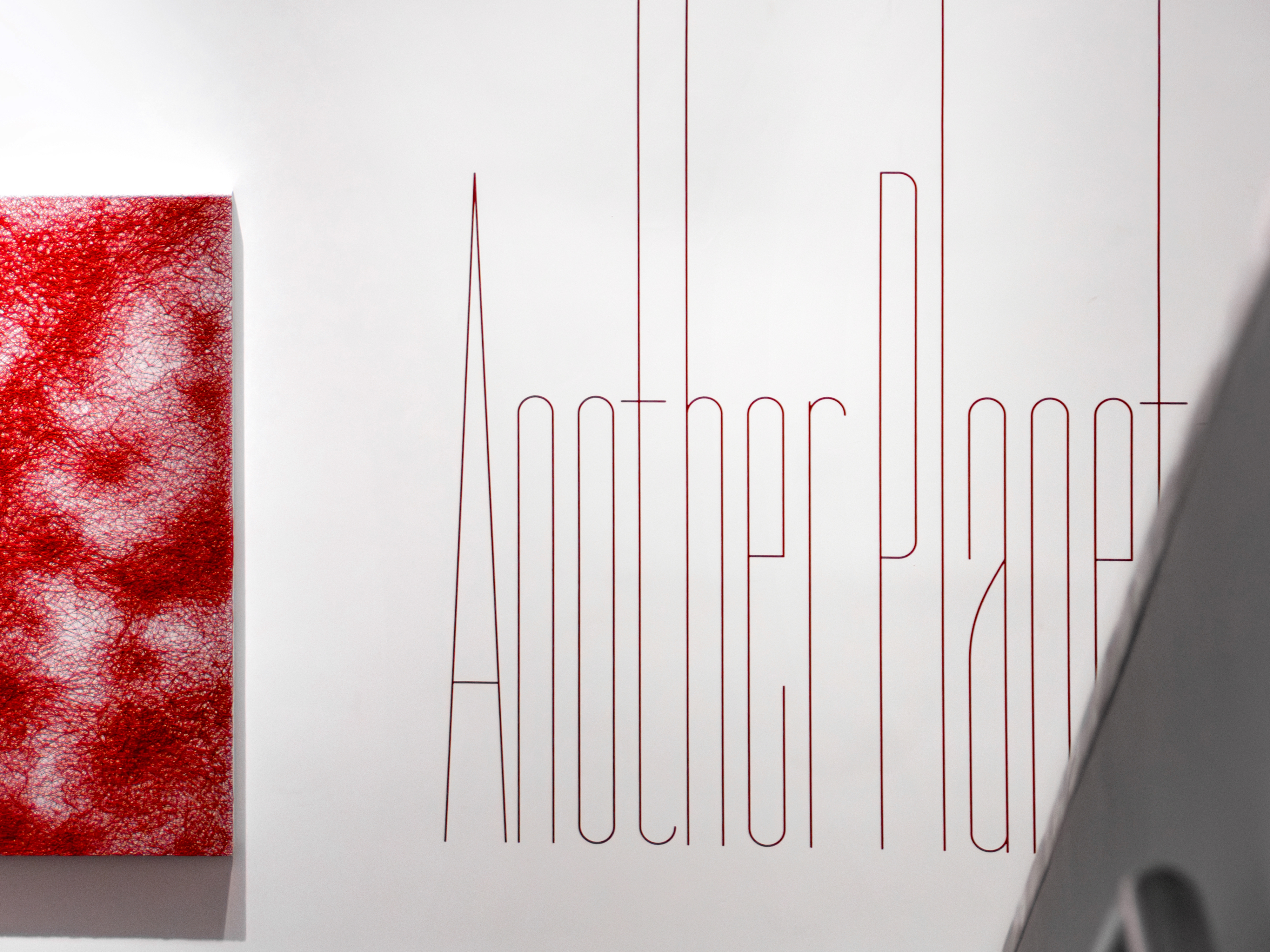
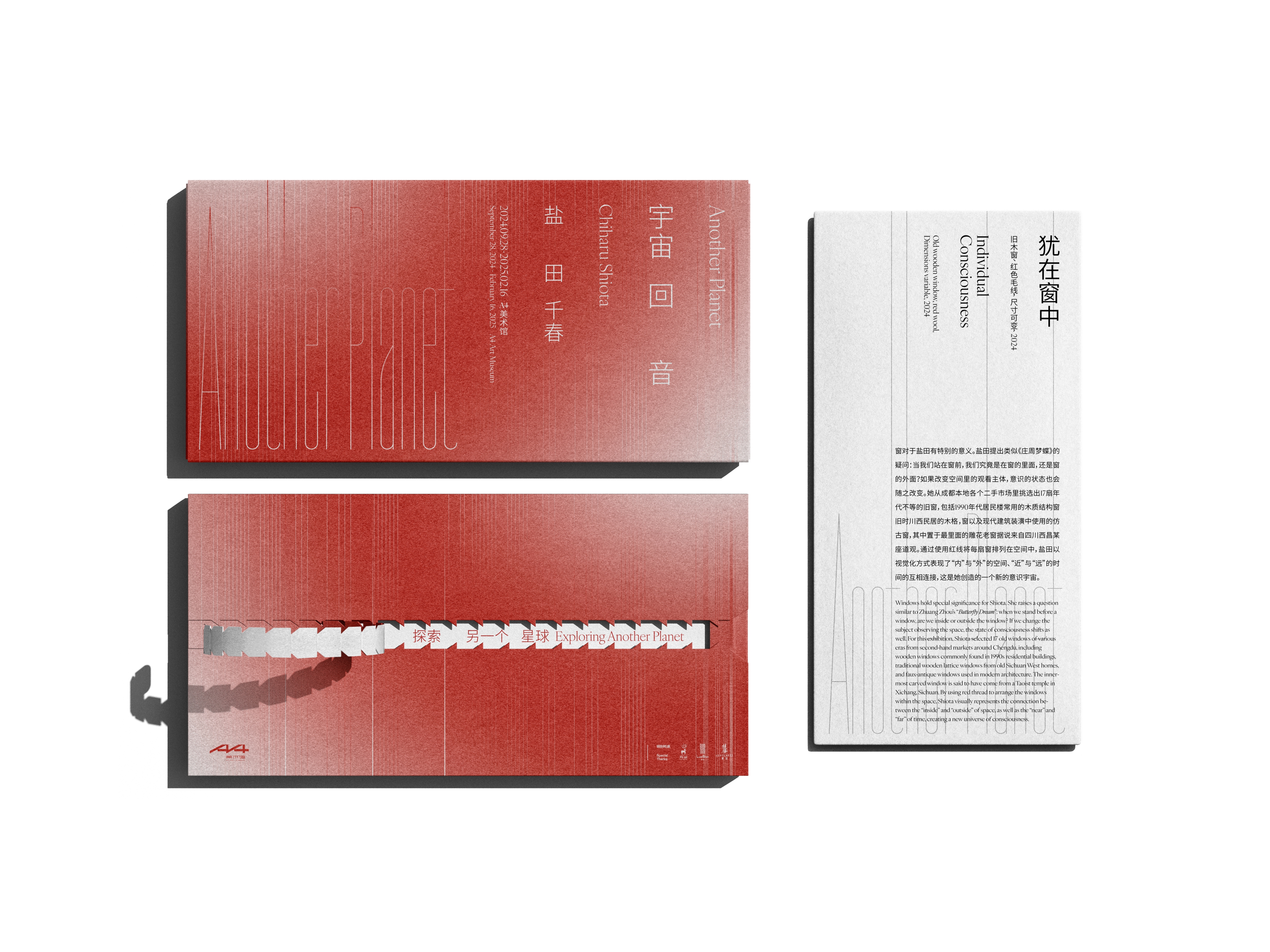
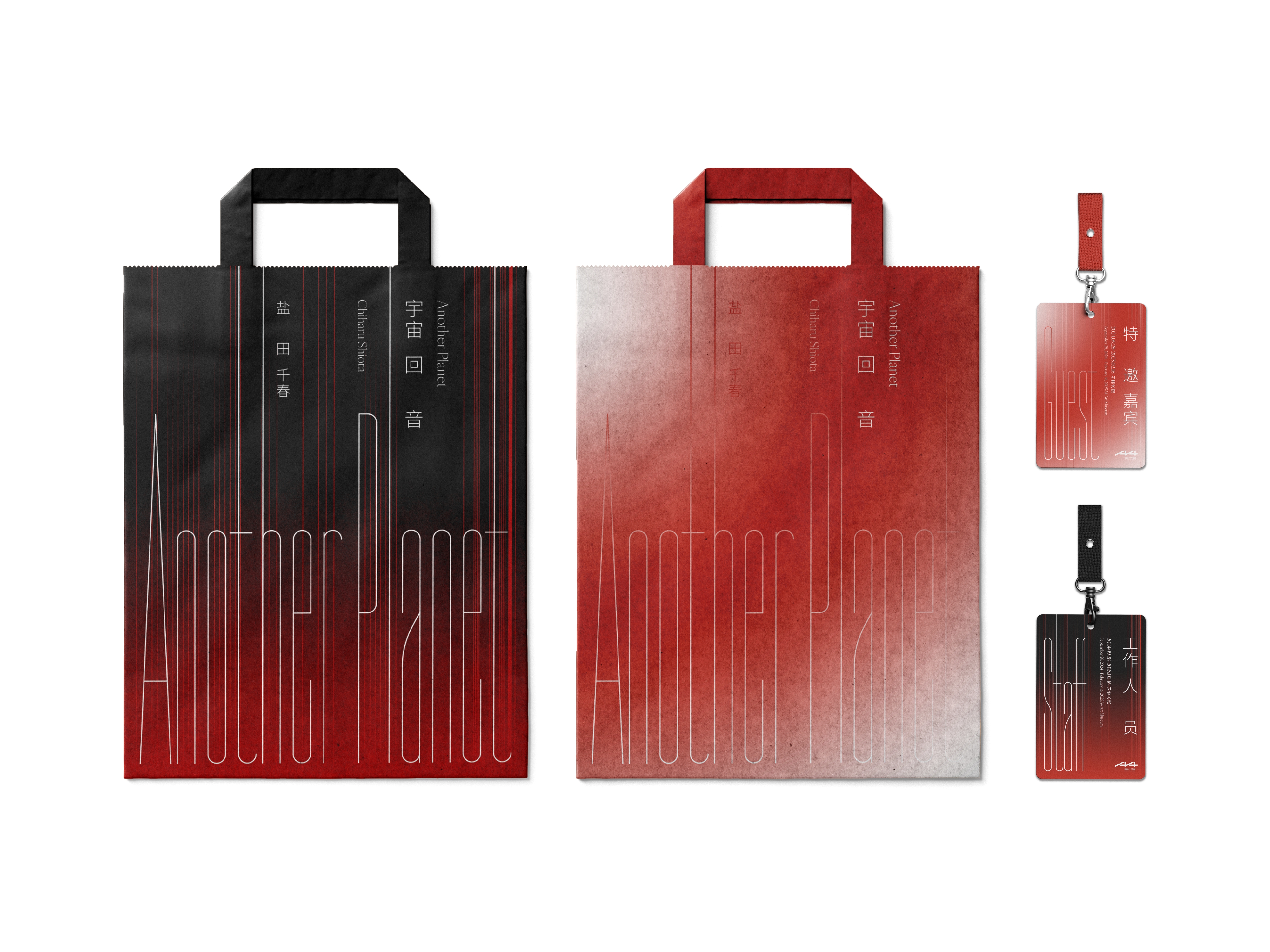
A4美術館為全球現象級藝術家「鹽田千春」在中國西南地區舉辦首次個展。主視覺纖長的字體設計呼應藝術家作品中大量使用的「線條」元素。
A4 Art Museum presents the first solo exhibition of global phenomenon Chiharu Shiota in Southwest China. The long and slender typography in the main visual echoes the "line" element used extensively in the artist's work.
Sep. 2024
展覽視覺設計
👉 Read More 閱讀更多

